Home / All / Market Trends / A/W 2027/28 Loungewear Color Trends: A Buyer's Guide
A/W 2027/28 Loungewear Color Trends: A Buyer's Guide
Nov 11,2026
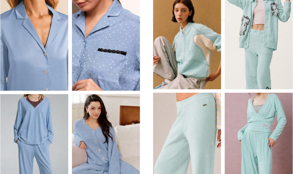
Soft blue and mint color directions across pajama sets, knitwear and relaxed loungewear styles.Loungewear Trends & Product Development |
November 2026
For Autumn/Winter 2027/28, loungewear
brands should start with a focused
color palette, not a long list of
trending shades. Choose colors that
fit the collection, check how they
look on the intended fabrics,
and approve physical samples
before committing to bulk production.
Soft blues, earthy browns, muted pinks
and deep burgundy tones are worth
exploring for the coming season.
But a color that looks beautiful
on a trend board may appear
quite different on a modal-blend
lounge set, brushed sweatshirt
fabric or ribbed knit.
This guide looks at six
Autumn/Winter 2027/28
loungewear color directions
and explains how private label
brands can turn those ideas
into practical product decisions:
which styles to develop,
how many colors to launch,
what to test and what to
confirm before bulk production.
Quick Answer
Which colors should loungewear
brands consider for A/W 2027/28?
Blue Bell, Cooling Oasis,
Muted Clay, Tortoise Shell,
Zinfandel and Hibiscus offer
six possible seasonal directions.
Softer colors can be explored
for relaxed knit sets and
lounge tops, while deeper shades
can anchor matching sets,
wide-leg pants and winter layers.
These are product-development
suggestions, not proven
bestsellers. Brands should
validate customer demand,
fabric suitability, color
consistency and order quantities
before production.
1. What Are the A/W 2027/28
Loungewear Color Directions?
Color forecasts are useful
because they give design teams
a starting point. They don't
tell a brand exactly what
customers will buy.
A publicly available A/W 2027/28
women's loungewear trend study
published by POP Fashion identifies
ten reference colors covering
pale tones, warm natural shades
and deeper colors.
These include soft blues,
muted clay tones, warm browns,
reds and burgundy directions.
For this guide, we have selected
six shades as possible starting
points for custom loungewear
collections.
The selection focuses on
potential product applications,
not independently measured
sales performance.
More importantly, we look
at these colors through
a manufacturing lens:
fabric composition,
knit structure,
matching sets, color approval
and repeat-order consistency.
Understanding the Forecast
A forecast shade is not
automatically a bestseller.
Before making it the main
color of a seasonal collection,
consider your own sales history,
target customers,
distribution channels
and launch budget.
2. Six Color Directions for
Custom Loungewear Collections
Instead of treating every
trend shade as a separate
product opportunity,
consider the role each
color could play in
a coordinated collection.
The following six shades
can be explored across
lounge sets, relaxed pants,
soft tops, hoodies
and knitted casualwear.
Blue Bell
Reference: 14-4121 TPG
Modal-Blend Sets
Wide-Leg Pants
A soft, muted blue
that could work for
relaxed matching sets,
lounge tops and
fluid wide-leg pants.
When the top and bottom
use different materials,
check their finished
shades together.
Cooling Oasis
Reference: 12-5302 TPG
Ribbed Loungewear
Lightweight Sets
A pale blue-green direction
for ribbed camisoles,
relaxed tops and soft
lounge sets. Raised ribs
and smooth surfaces
can reflect light differently,
making physical
fabric comparisons important.
Muted Clay
Reference: 16-1330 TPG
Cotton Lounge Sets
Relaxed Tops
A warm clay-inspired
shade for cotton-blend
lounge sets, relaxed
tops and comfortable pants.
A smooth jersey fabric
and brushed sweatshirt
material may show
noticeable differences
in surface appearance.
Tortoise Shell
Reference: 19-1241 TPG
Lounge Pants
Coordinated Sets
A deeper brown option
for relaxed trousers,
matching sets and
understated casualwear.
For dark colors,
review relevant
washing and rubbing
colorfastness requirements
before bulk approval.
Zinfandel
Reference: 19-1522 TPG
Winter Lounge Sets
Soft Knit Tops
A deep burgundy direction
for autumn/winter
coordinated sets,
hoodies and knitwear-inspired
loungewear. When combining
fabrics with different
compositions, confirm
color matching on
actual finished samples.
Hibiscus
Reference: 18-1762 TPG
Holiday Capsules
Accent Color
A stronger red that
could work for
holiday-inspired
lounge sets,
limited seasonal styles
or contrast details.
For brands with
uncertain demand,
consider validating
the color before
expanding the assortment.
Color note: These digital swatches
are approximate illustrations
based on seasonal research
references. They are not
official Pantone color
reproductions or approved
fabric dyeing standards.
Soft blue and mint color directions across pajama sets, knitwear and relaxed loungewear styles.
Color appearance
under stretch,
recovery and
surface texture
Brushed Sweatshirt Fabric
Hoodies,
sweatshirts,
winter lounge sets
Nap consistency,
pilling,
wash appearance
Waffle Knit
Textured lounge sets,
comfortable tops
Shrinkage,
surface shading
and fabric stability
Practical Buyer Tip
When developing matching
loungewear sets, compare
the approved top and
bottom fabrics side by side
under agreed lighting.
If the colors look different,
determine whether the
difference is acceptable
before approving the order.
4. How to Build a Coordinated
Private Label Loungewear Palette
A successful color plan
doesn't require a large
number of shades.
It requires a clear
relationship between
the garments in
the collection.
Consider a small
loungewear range
with three products:
a relaxed hoodie,
wide-leg lounge pants
and a fitted top.
Instead of producing
every style in six
seasonal colors,
the brand could begin
with one core neutral,
one main seasonal shade
and one limited accent.
Color Role
Example
Purpose
Core Color
Approved black,
gray or neutral
Maintain continuity
with established styles
Main Seasonal Color
Blue Bell,
Muted Clay
or Tortoise Shell
Create a coordinated
seasonal product direction
Supporting Color
Cooling Oasis
or Zinfandel
Add variation
across selected products
Statement Color
Hibiscus
Test a stronger
seasonal accent
The right combination
depends on the brand's
customers and price
positioning.
An established brand
may already know which
core colors perform well.
A new label may need
a smaller assortment
while it learns
what customers prefer.
Trend research can
support those decisions,
but it should not
replace actual
commercial evidence.
5. How Many Loungewear
Colors Should a Brand Launch?
Adding more colorways
can make a collection
look more varied.
It can also increase
the initial order
commitment.
Consider a hypothetical
collection with three
loungewear styles,
five sizes per
style-color combination
and 100 garments
per style per color.
Compare a two-color
assortment with
a four-color one.
Example: Color Count and
Initial Production Quantity
Assumptions: 3 styles,
5 sizes and 100 pieces
per style-color.
This is an illustrative
calculation, not a
customer order or
binding MOQ quotation.
2 Colors per Style
600 Pieces
4 Colors per Style
1,200 Pieces
1,200 − 600 = 600 Additional Pieces
Doubling the color count
doubles the garment
quantity under these
fixed assumptions.
Material minimums,
pricing and other
production costs
are excluded.
Planning Metric
2 Colors
4 Colors
Styles
3
3
Colors per Style
2
4
Units per Style-Color
100
100
Style-Color Combinations
6
12
Style-Color-Size
Combinations
30
60
Total Garments
600
1,200
The number of styles
has not changed,
yet the total garment
commitment has doubled.
Each extra color may
also require additional
sample approvals,
inventory planning
and production coordination.
For a new brand,
a controlled color
assortment can make
the first collection
easier to manage.
7. What Should Brands Test
Before Approving a New Color?
A color may look
good on a new fabric
swatch but still
require further
verification.
For loungewear,
washing, rubbing,
dimensional change
and surface appearance
can affect the
finished product.
The appropriate test
requirements depend
on the material,
garment design,
care instructions
and target market.
Check
Relevant Reference
What to Evaluate
Washing Colorfastness
ISO 105-C06:2010
Color change
and staining
after specified
laundering conditions
Rubbing Colorfastness
ISO 105-X12:2016
Dry and wet rubbing
performance where
applicable
Fabric Dimensional Change
AATCC TM135-2025
Length and width
changes after
defined laundering
Shade Matching
Agreed visual
or instrumental review
Difference between
actual fabric shade
and approved reference
Finished Set Appearance
Approved garment
sample review
Top/bottom coordination,
surface appearance,
seams and trims
These methods provide
ways to evaluate materials.
They do not establish
a single universal
pass or fail score
for all loungewear.
The brand and manufacturer
should agree on
appropriate test conditions
and acceptance requirements.
Example: Reviewing One Color
Across Two Fabrics
Consider a brand
developing Muted Clay
on a modal-blend lounge
top and cotton-spandex pants.
A practical review
would compare approved
Lab Dips, finished
fabric appearance
and relevant test
results for both materials.
Review Item
Modal-Blend Top
Cotton-Spandex Pants
Target Color
Muted Clay
Muted Clay
Fiber Composition
To be confirmed
To be confirmed
Lab Dip
Pending approval
Pending approval
Washing Colorfastness
Pending test
Pending test
Dimensional Change
Pending test
Pending test
Visual Shade Matching
Pending review
Pending review
Evidence Note
The table above
is a proposed
fabric comparison
framework, not
completed laboratory
testing. Actual
numerical results
should only be
reported when
supported by
documented tests.
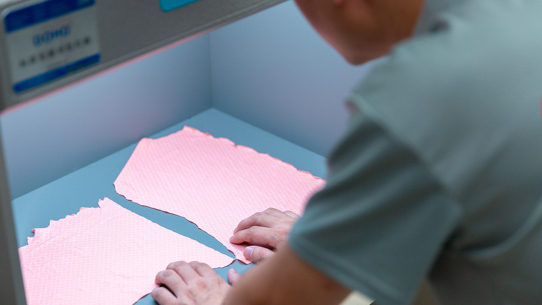
Comparing fabric samples under an inspection light source helps buyers review material appearance before production approval.
8. What Should Be Included
in a Loungewear Color Specification?
A sourcing brief
that simply says
"soft brown lounge set"
may be enough to
start a conversation.
It is not enough
to control bulk
production.
For private label
loungewear, each
color should connect
to a specific product,
fabric and approved
production reference.
Specification
Buyer Confirmation
Product Style
Style code,
category and
approved revision
Colorway
Brand color name
and reference
Fabric
Composition,
knit structure,
finish and material code
Lab Dip
Approved reference,
version and sign-off
Matching Components
Main fabric,
rib, binding,
thread and trims
Quality Requirements
Agreed colorfastness,
wash and appearance
criteria
Order Details
Quantities by
style, color and size
Bulk Reference
Approved sample,
fabric lot and
production revision
These records are
especially useful
when the brand
reorders the same
style in a later
season.
A repeat order
should reference
the approved
technical standard,
not just a
color screenshot
or a previous
commercial name.
9. Pre-Production Color
Approval Checklist
Before releasing
a new loungewear
color for bulk
manufacturing,
confirm the
following details.
Buyer Approval Checklist
Confirm the target
color and physical reference.
Approve the fabric
composition and construction.
Review the Lab Dip
on actual production-intent fabric.
Check tops, pants
and matching trims together.
Agree on relevant
colorfastness and wash tests.
Confirm quantities
by style, color and size.
Approve the final
garment sample.
Keep the approved
color reference for reorders.
A documented approval
process doesn't guarantee
that every garment
will be identical.
It does give buyers
and manufacturers
a clearer basis
for checking production
and resolving
unexpected differences.
Frequently Asked Questions
What are the loungewear
color trends for A/W 2027/28?
This guide highlights
Blue Bell, Cooling Oasis,
Muted Clay, Tortoise Shell,
Zinfandel and Hibiscus
as six possible
development directions.
They are selected
from published trend
research and are
not verified
bestselling colors.
Are light colors suitable
for winter loungewear?
Yes, depending on
the fabric, design
and intended customer.
A pale blue can be
used in a warm
brushed lounge set,
while a darker shade
may be used in
lightweight knitwear.
Why can the same color
look different on modal
and cotton loungewear?
Fiber chemistry,
fabric construction,
dyeing and finishing
can affect the final
appearance. Buyers
should compare actual
fabric samples
before approving
matching sets.
Can Pantone TPG references
be used directly
for bulk fabric dyeing?
TPG references can
communicate a visual
direction, but they
should not replace
an agreed textile
standard and approved
fabric samples.
Pantone TCX is
intended for textile
color communication.
How many colors should
a new loungewear
brand launch?
There is no universal
ideal number. A focused
first collection could
begin with a core
color and one or two
seasonal options.
The final decision
should consider demand,
budget, fabric supply
and actual MOQ.
What should a brand send
to a custom loungewear
manufacturer?
Provide product sketches
or reference garments,
preferred fabrics,
target colors,
size range,
branding requirements
and estimated order
quantities. Technical
specifications can
help clarify the
development process.
Final Takeaway:
A Good Color Palette Is
Also a Production Plan
A seasonal color forecast
can give your brand
a fresh direction.
But the colors only
become useful when
they work with
real products,
approved materials
and a practical
order plan.
For A/W 2027/28,
consider starting
with a dependable
core shade,
one main seasonal
color and a
limited accent.
Then review the
actual fabrics,
approve the shade,
check the finished
garments and retain
the production
reference.
That is how
a color idea
becomes a collection
that can be developed
and manufactured
against agreed
requirements.
Planning Your 2027/28
Loungewear Collection?
Send your design references,
preferred fabrics,
target colors,
size range and
estimated order quantities
to Call The STYLE.
Our team can discuss
custom lounge sets,
fabric sourcing,
private label branding,
sample development
and color approval
before bulk production.
AATCC TM135-2025:
Fabric dimensional changes
after home laundering.
View method
.
Methodology:
Six color directions
were selected from
available A/W 2027/28
loungewear trend research.
Product applications
are editorial suggestions.
The quantity calculations
are hypothetical examples.
The fabric testing tables
are proposed verification
methods, not completed
laboratory results.